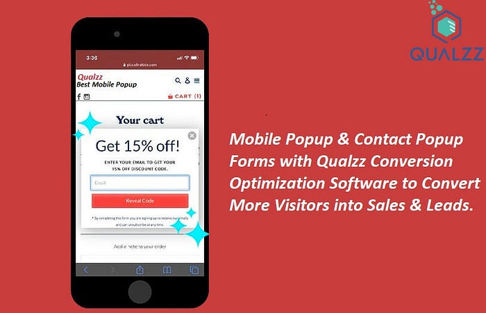
Mobile popups are an effective way to promote your brand and drive traffic to your website. They’re a useful tool for collecting email addresses and phone numbers, but you need to be sure they’re designed to be user friendly. That means making the most of their limited screen real estate. For example, you don’t want to overdo the fields or make them difficult to navigate. Instead, design mobile popups with the following in mind.
Creating an effective popup has become more important than ever with the influx of mobile users. The majority of people are accessing the internet from their smartphones and tablets, so it’s critical to make sure your marketing efforts are geared toward the mobile experience.
A mobile popup should be the right size and display the most important information. This includes the CTA (call to action) and the value prop. If you’re not using a responsive mobile site, make sure you test your mobile popups to see if your visitors are getting the message you’re trying to deliver. You may find that your conversions are increasing and you’re losing out on potential customers.
It’s not enough to put a cool-looking popup on your site. You need to think about what information you really need to communicate with your visitors and how easy it is to gather it. Rather than requiring your visitors to fill out an extensive form, consider short, concise forms that let them opt-in for your newsletter, share content on social media, or take other actions. Having a single signup form may be the best way to go, as your visitors will have a more pleasant experience.
Unlike desktop popups, mobile popups don’t have a lot of room to play with. But that doesn’t mean you have to settle for a clunky experience. To make sure your popup is a success, use a popup builder such as Poptin. They have a user-friendly interface and offer a variety of features to help you create your own.
While they aren’t a replacement for a dedicated mobile web page, they can be used in conjunction with it. For instance, if you’re hosting a survey, you could include a mobile popup to ask your visitors if they’d like to take the survey. Another option is to show them a slidebox when they exit.
Of course, you should be doing a lot more than that. The best mobile popups are the ones that offer the most value to your visitors and get the most results. Using a popup to display a landing page is one of the easiest ways to accomplish this. When creating your own pop ups websites, it’s also worthwhile to keep the content as concise as possible. Users don’t want to scroll through a long form to reach your call to action. Similarly, they don’t have the patience to type in lengthy text fields, so ensure the most important information is on the screen.
In addition, the most obvious mobile pop ups websites will not be the most exciting. You’ll have to get creative in order to stand out and make your mobile popup the talk of the town.
